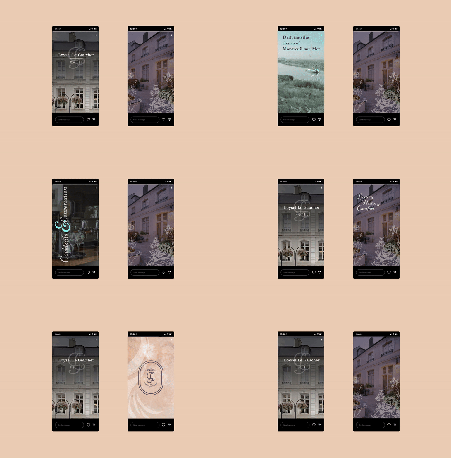
Developing the brand for Hôtel Loysel Le Gaucher was a journey of honouring history while embracing contemporary elegance. With a brief from Audrey Guérin, I designed the identity as she restored and transformed the Monument Historique listed building. Dating back to 1777, its château-like grandeur of bright-white stone, a cobbled courtyard, and ornate details exudes timeless charm. Inspired by its noble founder, the branding reimagines the LG initials above the entrance, creating a refined and enduring logo that bridges past and present.
The curated colour palette reflects the building’s 18th-century charm, inspired by its original decor and historic style. It includes soft stone hues, light blue from the original paintwork, muted greens, delicate lilac, warm rosewood pink, and understated neutrals. All tones that reflect the hotel's warmth and character.
The evolution of the emblem is shown here where past and present converge, ensuring that the essence of Hôtel Loysel Le Gaucher continues to be preserved and celebrated.

